Delivery
5 days
From zero to live storefront
// SwitzLabs — Custom ecommerce launch
SwitzLabs needed a complete ecommerce presence, not a visual refresh. We designed and developed the storefront from the ground up around clear product presentation, promotional bundles and a fast path from first visit to checkout.


Delivery
5 days
From zero to live storefront
Scope
Full build
Design, development and commerce
Platform
Custom-built
No generic storefront template
Focus
Conversion
Built around product movement
// The objective
SwitzLabs needed to enter the market with a storefront that already felt established. The experience had to communicate quality quickly, organise a growing product range and give customers clear reasons to move from browsing into a purchase.
The design could not rely on generic ecommerce blocks. Every section needed to support the offer, strengthen the brand or remove friction from the buying journey.
01
Use clean Swiss-inspired design, structured typography and polished product imagery to make the brand feel credible from the first screen.
02
Make individual products, categories and bundles easy to understand without overwhelming customers with unnecessary information.
03
Use focused calls to action, offer repetition, product recommendations and a streamlined purchase flow to keep the journey moving.
// The build
Module 01
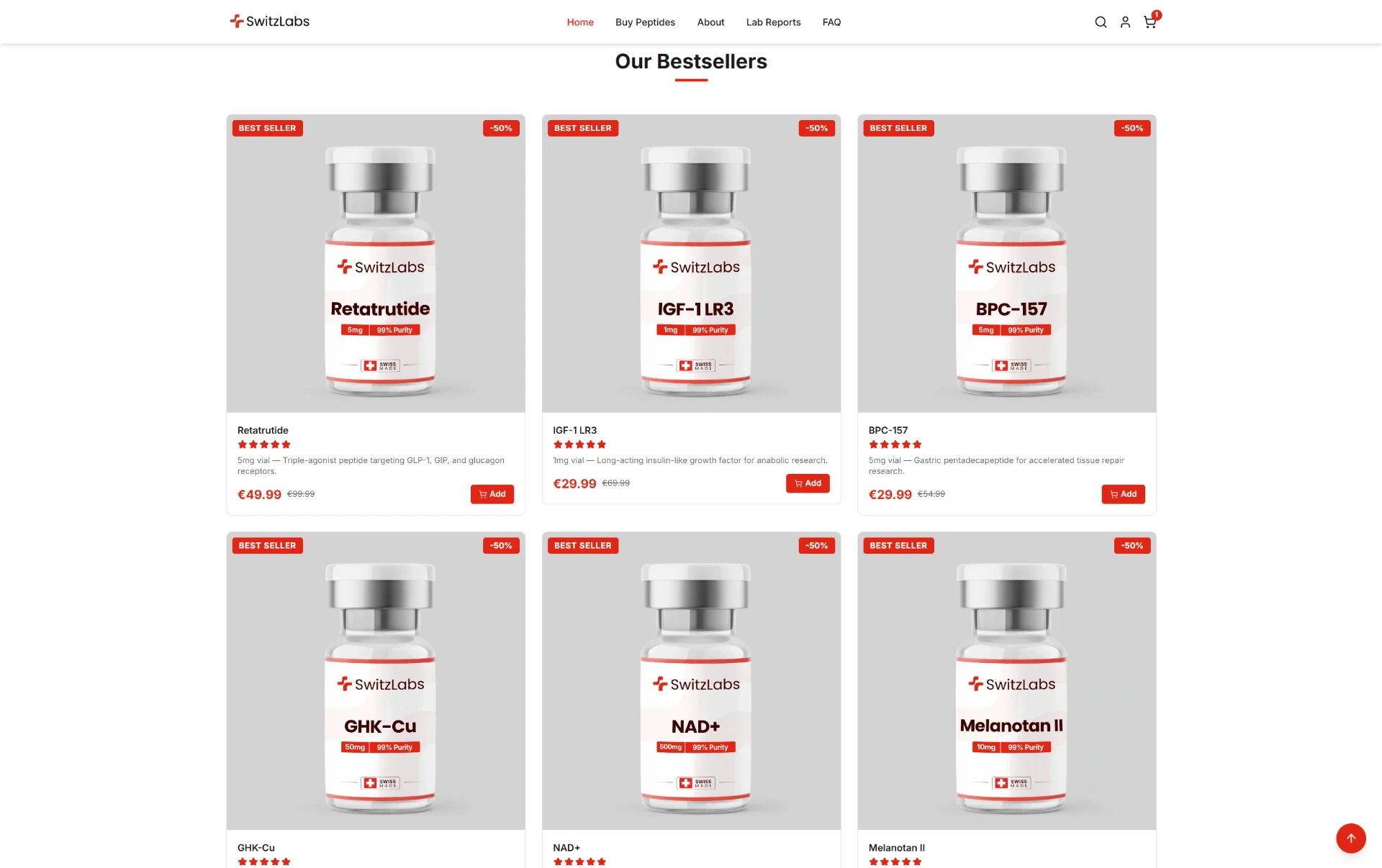
The SwitzLabs storefront uses a restrained white, red and neutral palette, bold product-focused typography and generous spacing. The visual system communicates precision and quality while keeping products, offers and calls to action easy to scan.
Module 02
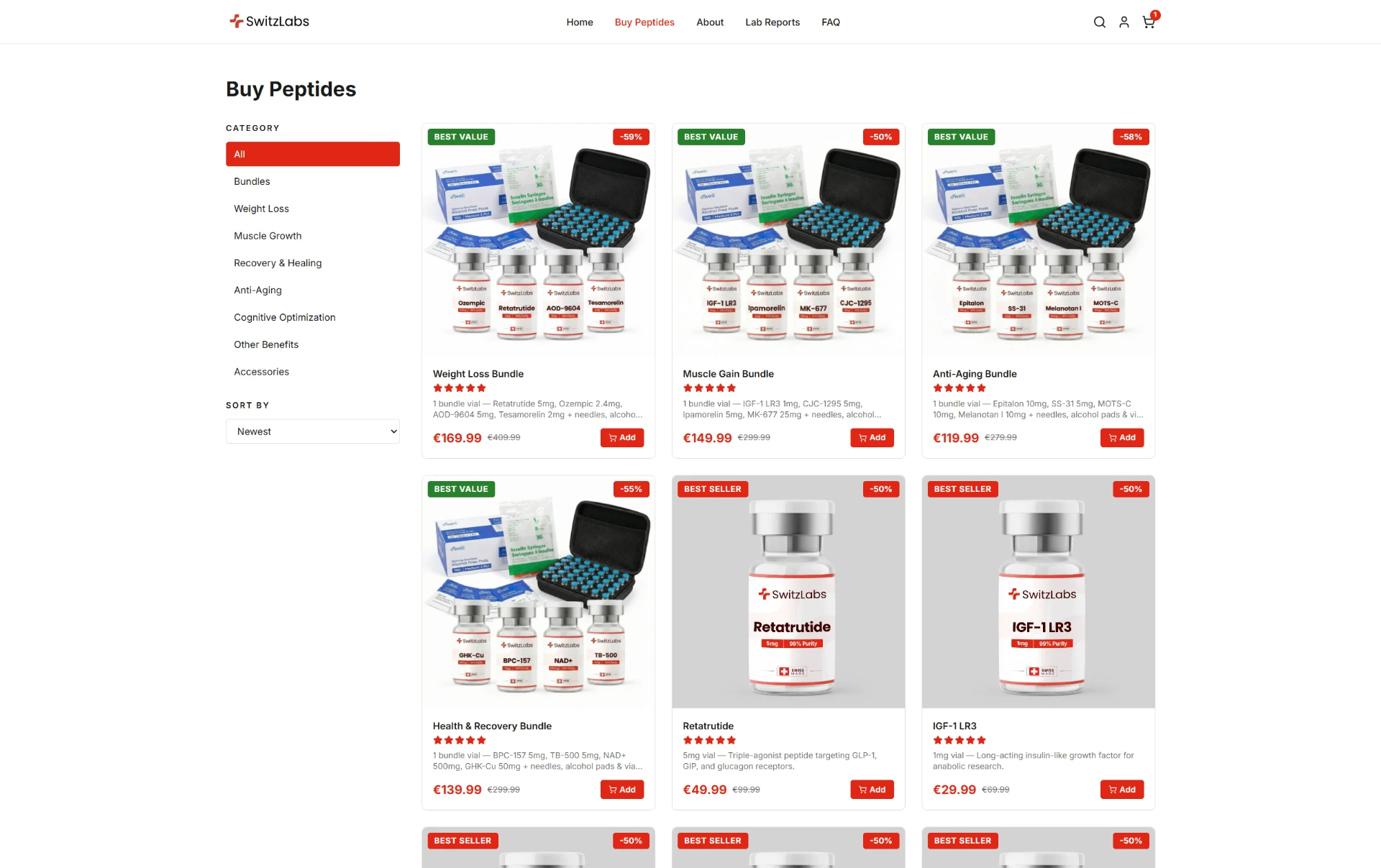
Products are organised through clear categories, prominent best sellers and consistent product cards. Visitors can understand what is available, compare options and reach the relevant product page without navigating through a complicated catalogue.
Module 03
SwitzLabs uses bundle merchandising and promotional messaging to give visitors a clear reason to purchase more than a single item. Offers are integrated into the storefront hierarchy instead of appearing as disconnected popups or generic discount banners.
Module 04
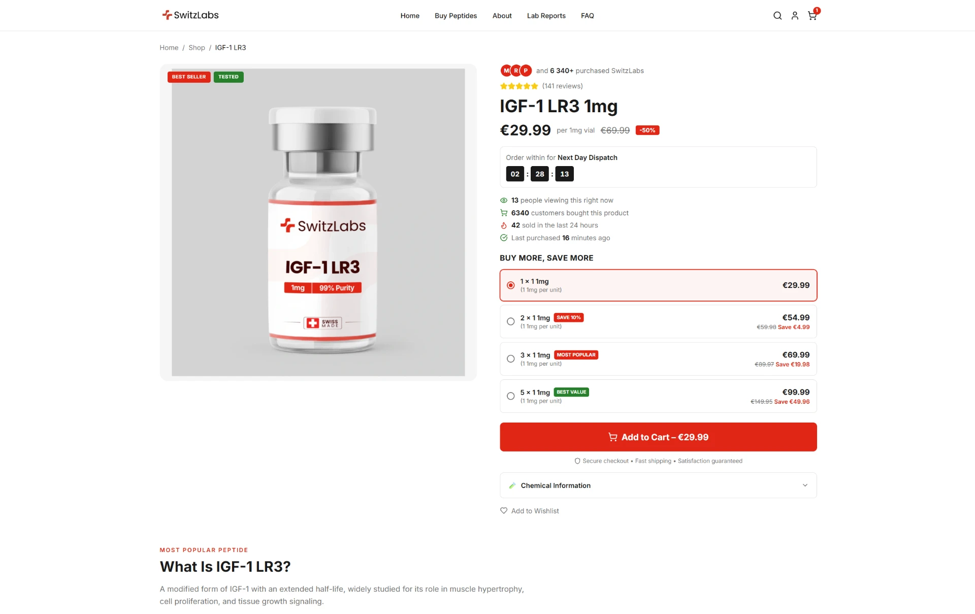
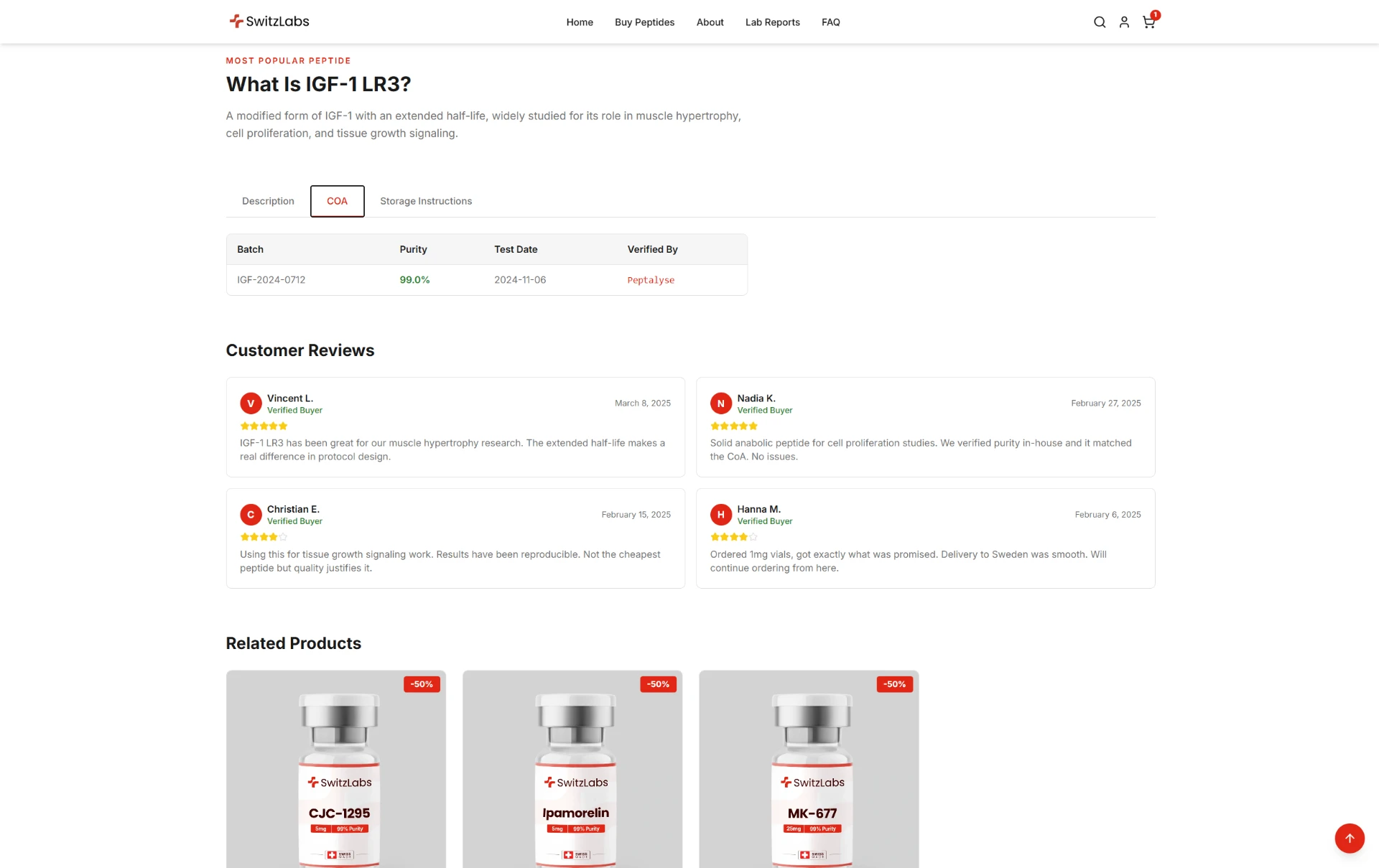
Product pages were structured around product clarity, pricing, options, supporting information and a direct purchase action. The goal was to help visitors understand the offer without forcing them through unnecessary pages before adding to cart.
// The merchandising system
The storefront was designed as a connected merchandising system. Promotional messaging introduces the offer, best sellers reduce choice friction, bundles create a higher-value option and related products continue the journey after the customer reaches a product page.
// The purchase flow
Product recommendations continue the merchandising journey while direct purchase actions remain prominent. Product information, pricing and related options stay connected without obscuring the route toward checkout.
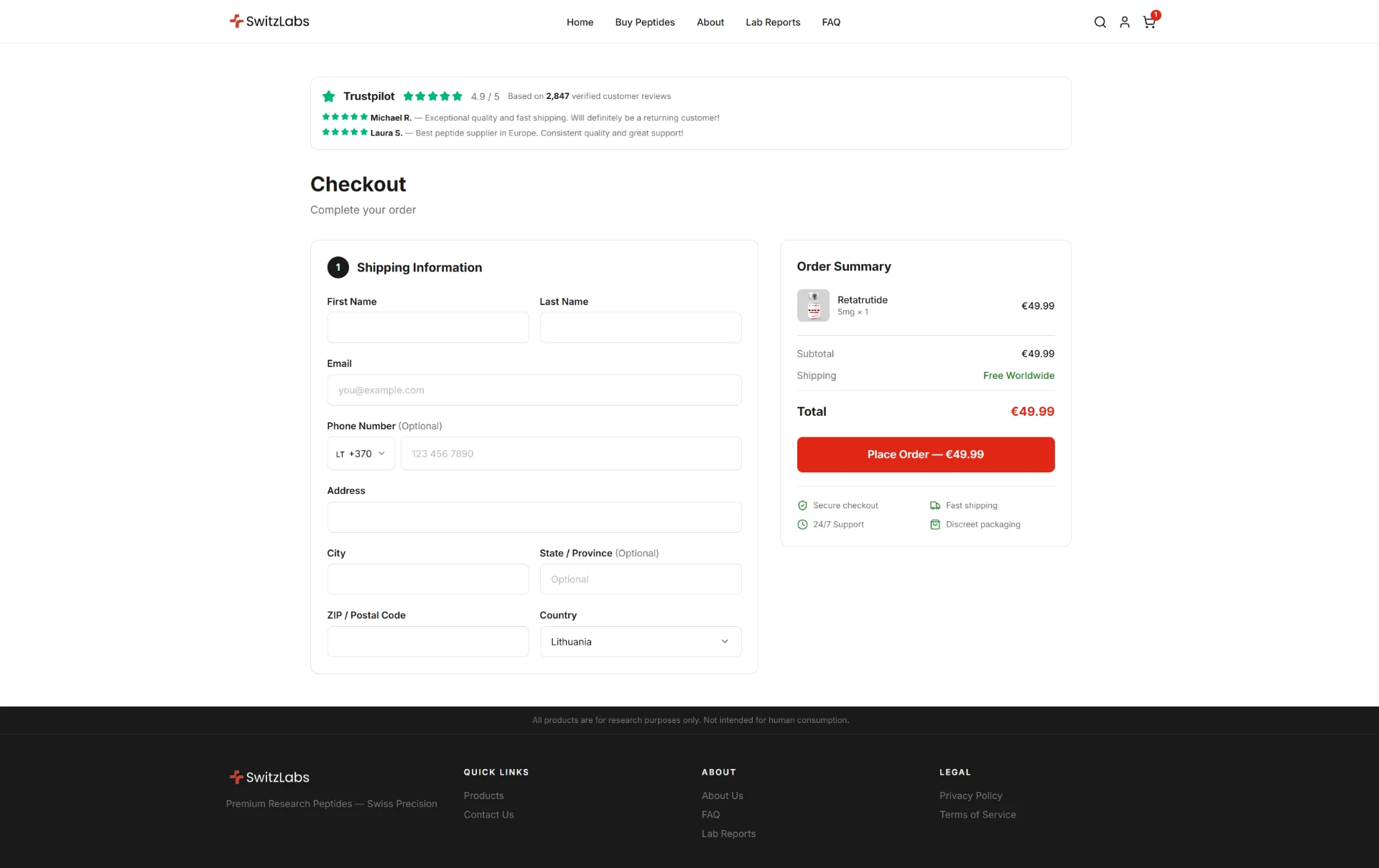
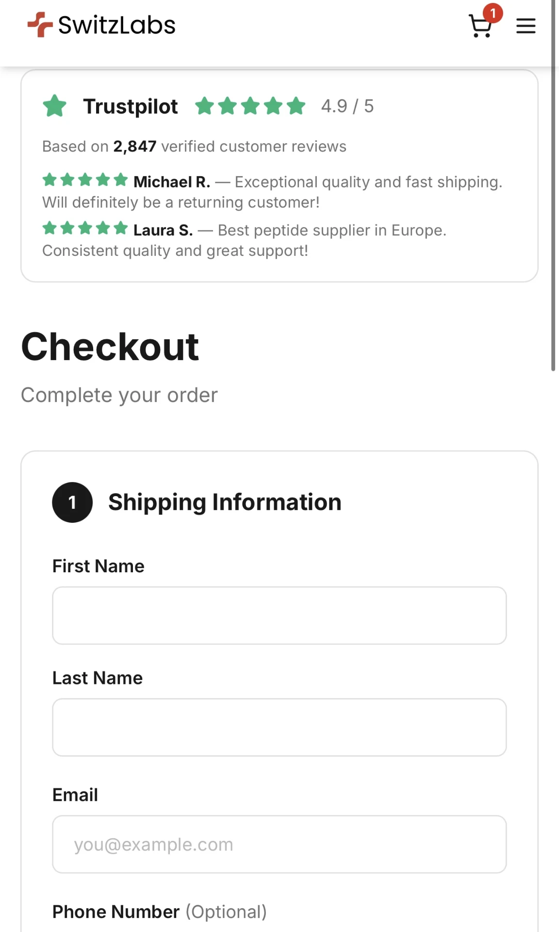
The checkout reduces the interface to the details required to complete the order. Customer information, delivery and the order summary are kept visually clear so the customer can finish without unnecessary distractions.
// Desktop + mobile
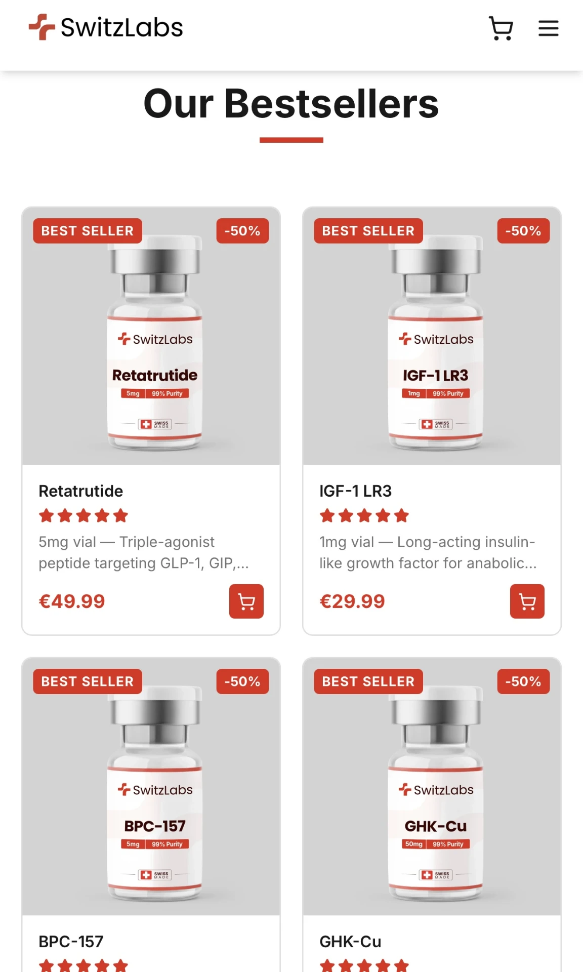
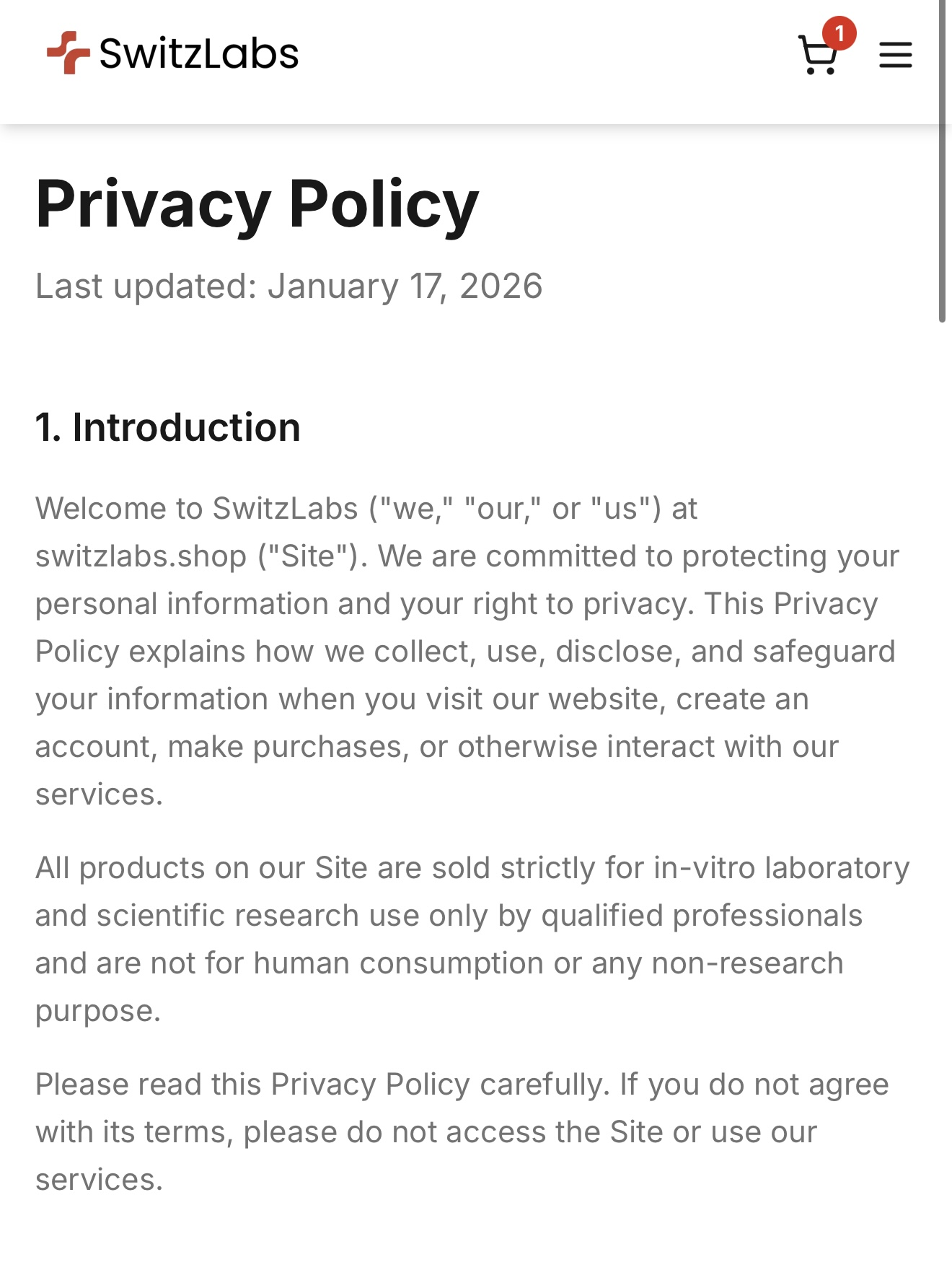
The mobile experience was designed independently rather than treated as a compressed desktop layout. Product cards, offer messaging, product pages and checkout controls remain clear and easy to use on smaller screens.
// The storefront
// The outcome
SwitzLabs launched with a custom storefront that connects premium brand presentation, product discovery, bundle merchandising and checkout into one consistent ecommerce experience. The full build was completed and launched in 5 days.
Brand
Premium Swiss-inspired identity
Products
Clear catalogue and product pages
Commerce
Bundles through checkout
Delivery
Built and launched in 5 days
// Build with Vialsites
We build custom research ecommerce stores where brand identity, product presentation and the path to checkout work as one connected system.